WINTER BLUES
Who’s got the blues? OK, not the actual blues, but if blue is a hue you enjoy, you’ll be happy about Pantone’s 2020 “Color of the Year”...Classic Blue! The enduring and elegant shade, reminiscent of the “sky at dusk,” offers a sense of calm and tranquility. And, it's not too shabby of a shade to decorate with either!
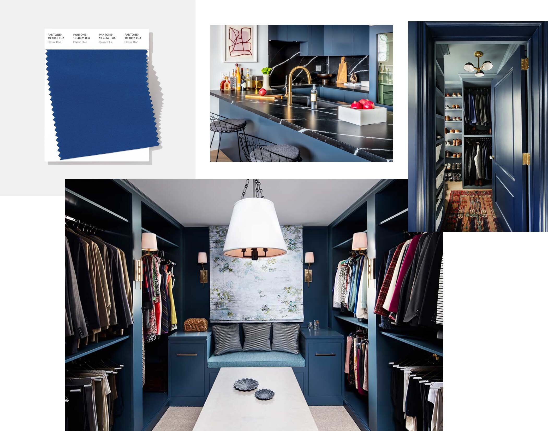
According to Pantone’s website, Classic Blue is meant to: “highlight our desire for a dependable and stable foundation on which to build as we cross the threshold into a new era.” Furthermore, Leatrice Eiseman, Executive Director of the Pantone Color Institute, says Classic Blue “encourages us to look beyond the obvious to expand our thinking; challenging us to think more deeply, increase our perspective and open the flow of communication.”
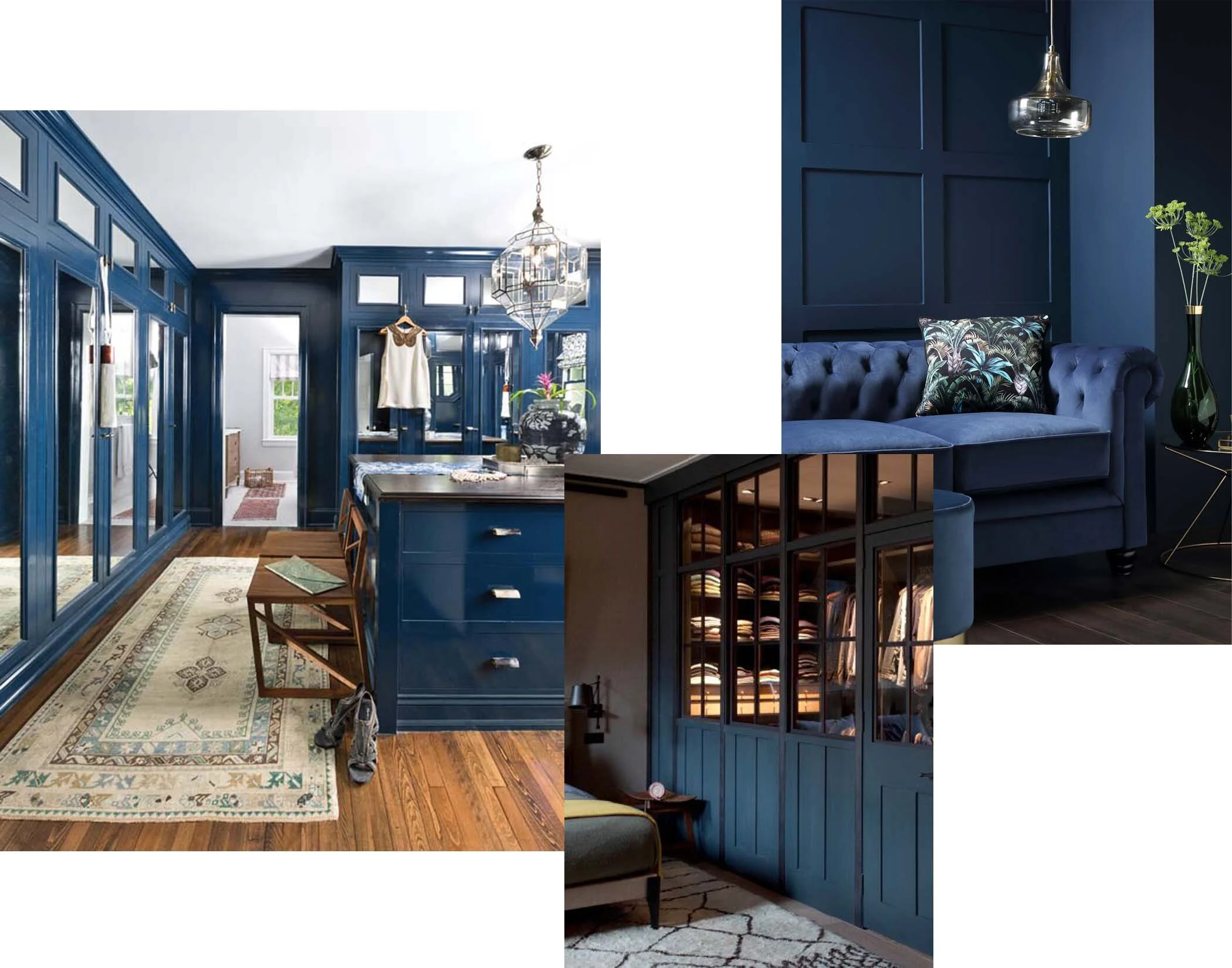
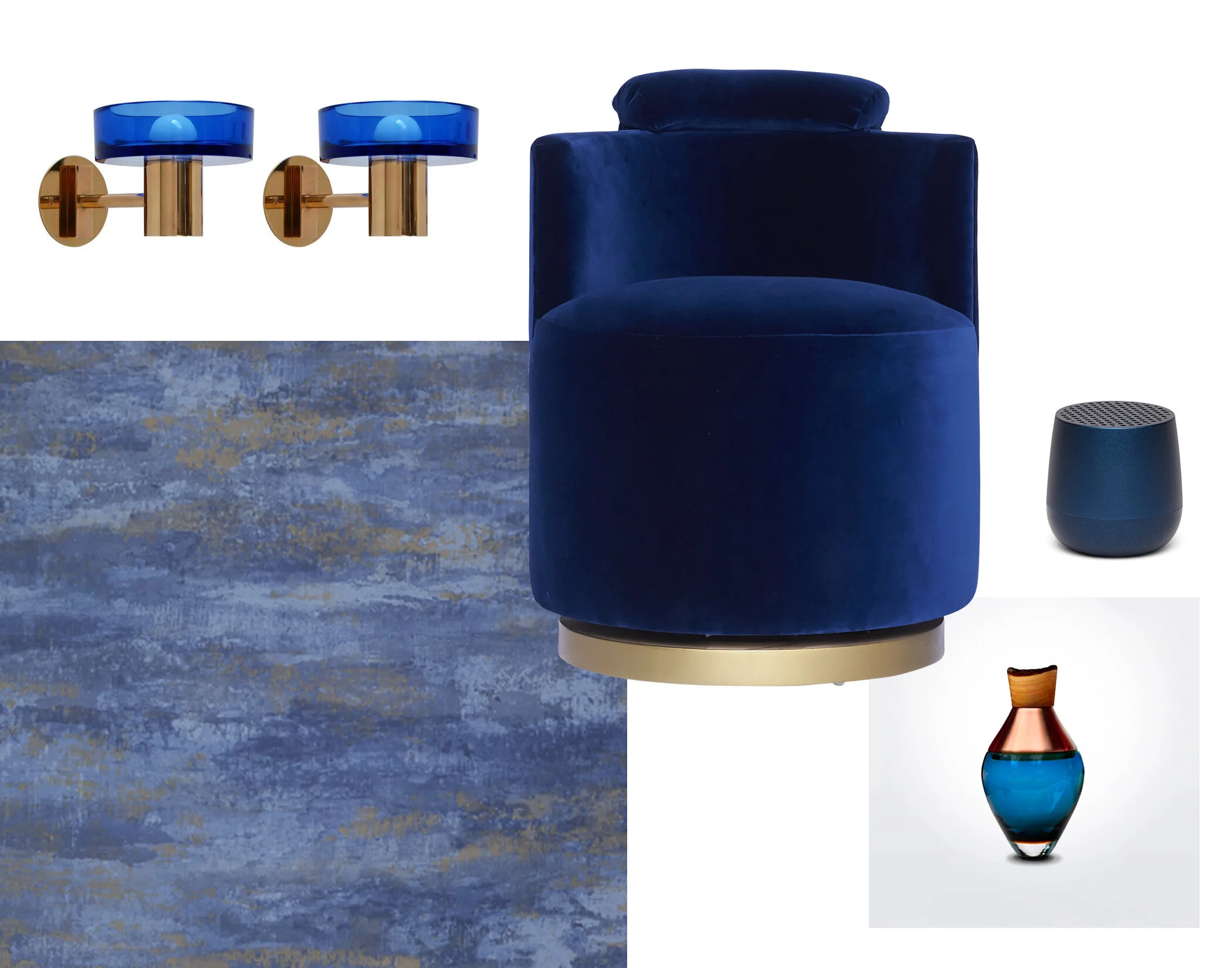
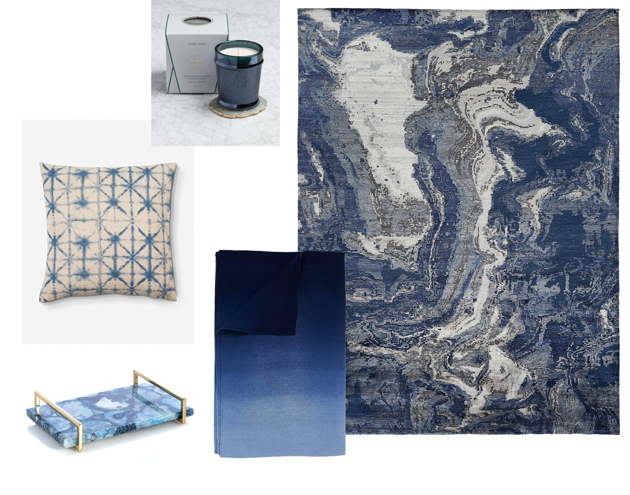
I, for one, am a fan of the cool color that offers plenty of versatility and luxury. As the name suggests, it’s classic! But beyond that, it’s a fun way to introduce color into a closet or interior space without having to be too bold. Need some inspiration? I love it mixed with gold for a touch of refined glam like on the base of an ottoman or woven into wallpaper, used delicately on a soft texture like a pillow or rug, and as a punch of color in accessories via items like vases and candles.
See below for a few variations of ways to work Classic Blue into your closet or home. No singing the blues here!